Steve Weinrebe
Out of the Mist: An Interview with The Grays Photographer
Steve Weinrebe
Steve Weinrebe |
 |
It's always a pleasure to see my work in print, and especially in such a nice treatment as 'The Grays' cover. I've been a professional photographer for 30 years and I still get a thrill out of seeing my work in a terrific layout. Usually I shoot for a planned layout ahead of time, but there's a nice serendipity to stock photography where an image can see many different uses.
The Alien in this photograph is a carefully constructed model, about 3 ft. high, that I commissioned from a terrific model maker, whom I knew from teaching, at the time, at the University of the Arts in Philadelphia. My intention was to create a photo series that was reminiscent of one of my favorite movie genres, 1950's science fiction (which of course was itself rooted in the news of the day). I shot the series in the Spring of '97.
My inspiration for the overall character of the work came from a brilliant photo editor at Photonica (now part of Getty Images), who challenged me to do something different and have some fun at the same time. I photographed my Alien in street scenes, as well as studio scenes. While many of the images I made with the Alien were a little 'tongue in cheek', the Alien in Mist series really stuck with me. I always believed that the most haunting surrealism is just a small step removed from reality, so to have the Alien just appearing, coming out of the mist, without any props or other background, ended up very successful.
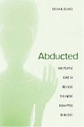 |
This seems to be the second book that this particular image has been used for in less than two years; it also appeared as the front cover of a book by Susan Clancy, which leads me to ask: In your opinion, which of these two covers did a better job using your source image?
As far as the two book covers you mentioned, I wouldn't be being strictly diplomatic by saying they are both very nicely done, and a good example of how a good designer can create a unique look, in this case two from the same photograph.¹
Hope this answers some questions. Nice web site. Look forward to reading
'The
Grays' and seeing the movie!
|
Beyond Communion.com thanks Steve Weinrebe for taking the time to share these thoughts. To see more of Steve Weinrebe's artwork visit GettyImages.com Notes: ¹ The designer of the cover of The Grays (responsible for the layout, the fonts, and image manipulation) was [TK] for Tor Books. The designer of the cover of Abducted was Tim Jones for Harvard University Press. |